Content Design Sample #2 - Mobile App Copy
The following is a brief breakdown of mobile app UI copy that I created as a final capstone project for the UX Writing Fundamentals course offered by the UX Content Collective. The course was designed to provide an overview of what it’s like to work in the content design discipline, breaking down the fundamentals of good UX writing practice and providing an opportunity to write all the copy for an imaginary application.
The Figma File
The Ask
During the course, we were asked to prepare a style guide for an imaginary mobile application called JobPay. This fictional app was supposed to allow business owners and freelancers to manage time tracking, invoices, and other necessary collaboration tasks in a convenient way.
By the end of the course, we were presented with a set of Figma screens, and asked to use this style guide and our newfound knowledge of content design to do a thorough, end-to-end review and update all of the copy in the mobile app.
No pressure, right?
The Process
The screens were broken down for us into distinct pages, which I’ll break down here.
Onboarding Screens
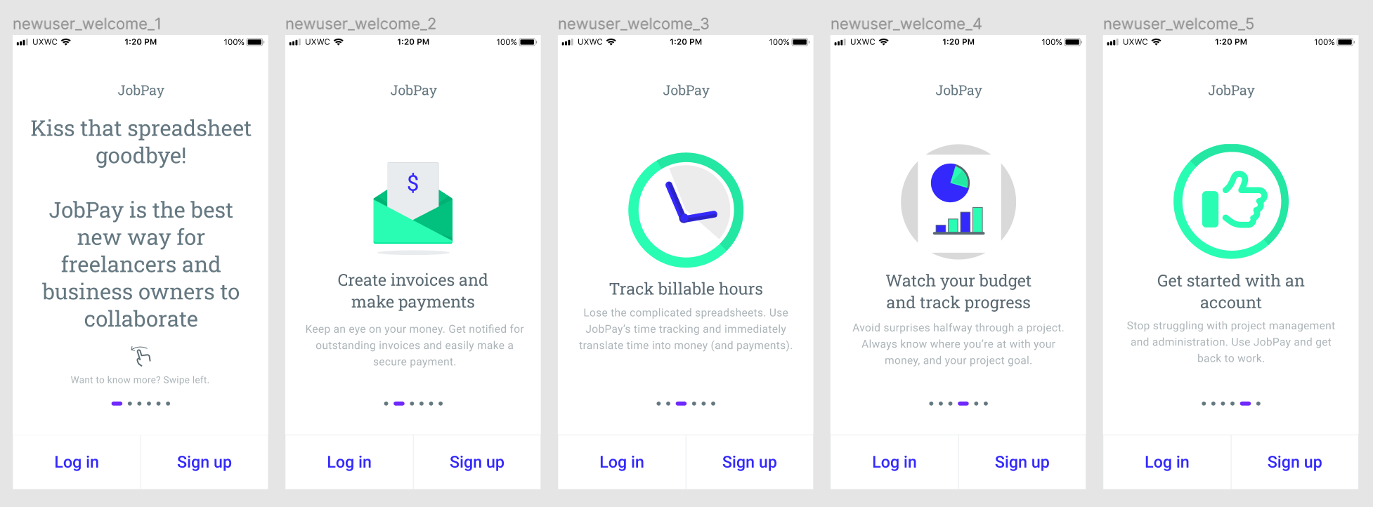
I saw the onboarding screens before during the midterm assignment for the course. It wasn’t a surprise to see them back in the final project, where I’d be given the opportunity to improve on my first iteration.
My first attempt wasn’t the best. I missed the mark on explaining the user benefit to each of the features I had selected, because I wasn’t sure what exactly the features of the app were supposed to be. I took the feedback from the midterm (which is unfortunately lost to Figma’s free version history) and settled on this for the first round of the onboarding screens:

I also took a stab at adding some icons. It was fun playing around with the actual design tools in Figma, but I don’t think I should attempt to moonlight as a UI designer just yet.
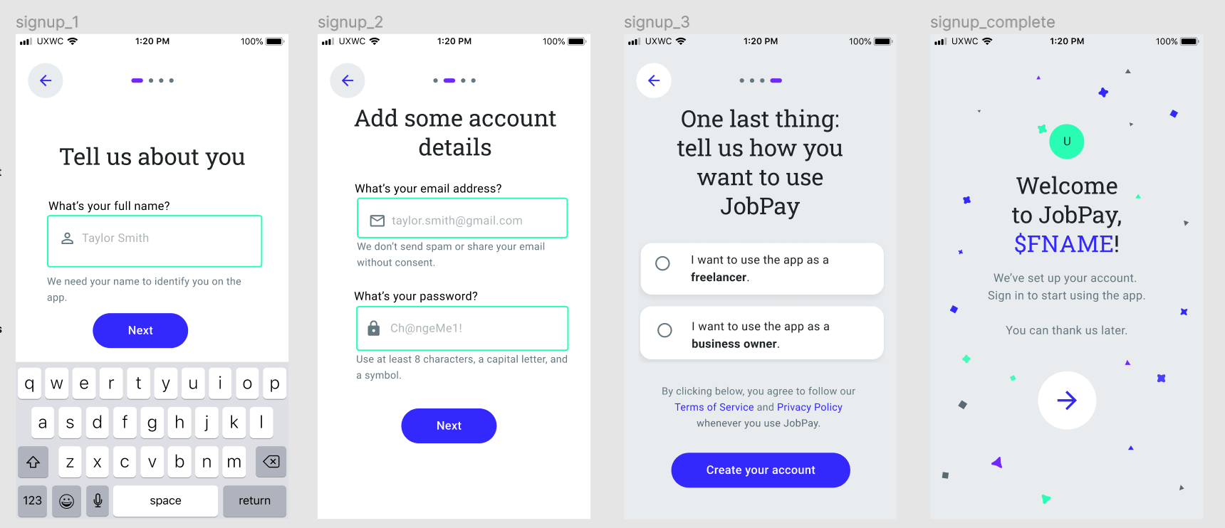
Next was actually collecting the user information during the onboarding process:

To use the app, the designs indicated that we needed the user’s full name, an email address, and a password.
For the first screen, I wanted to strike a friendly tone with using “Tell us about you.”
I used some hint text to tell the user what we were expecting, trying to use a gender-neutral name, and a brief explanation about why the full name was being requested to ease any concerns.
On the next screen, we need some of the account details. Again, I wanted to use hint text and some instruction text to ease worries and explain the expectations for each of the fields. The screen originally had another keyboard overlaid, but I wanted to hide that to give space for the various form fields.
I used an example password, but for security, I’m still debating whether the example was the right choice. It showcases the requirements below the field, but if every user just enters that as their password…
The last bit of information is figuring out what class of user is going to be using the app, as the workflows are different based on whether the user is a freelancer or business owner. I used bold to emphasize the actual choice the user is making, but still wanted the options to read as full and complete sentences.
On the last screen, I wanted to inject a bit of personalization by using the user’s first name to welcome them to the app, and a bit of brand personality with the final welcome message that lets them know what to do next.
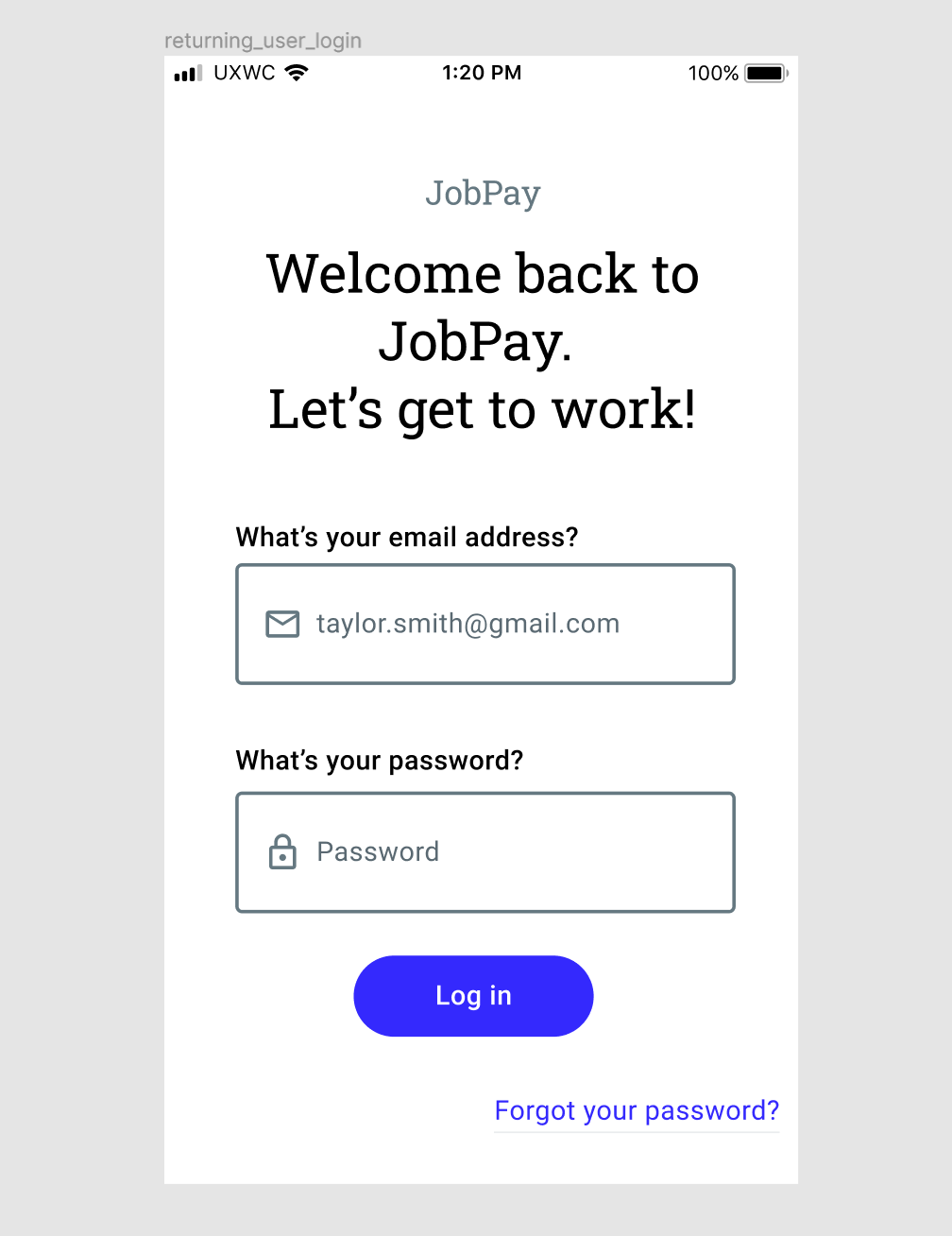
The last of the onboarding screens is the log-in screen:

Freelancer Flows
I had to add a lot of extra screens to the freelancer flows to make the content make sense, because the actions were missing from the provided designs.
I focused on establishing the language that would be shared across the freelancer and business flows, and guiding the freelancer through setting up and managing projects.
It was made quite clear that the freelancers would probably be more nervous than the business owners, so I wanted to strike a friendly and encouraging tone to keep them motivated through the set-up and different flows.
Business Owner Flows
For the business owners, I wanted to make sure to keep the same language from the freelancer flows so that the users could make sure that they were talking about the same things in the app.
I focused on keeping things super simple, even with the added screens.
Business owners were billed as being the ones growing the community on the app, but not necessarily the main revenue drivers, so I just wanted to keep things as clean and simple as possible for them, to keep them using the app moreso from a standpoint of convenience and ease-of-use.
I could probably dive into making a proper PayPal flow for both sets of users, but that’s a future stretch goal that wasn’t required by the project.
The Result
I got some great feedback on my project, which I made sure to incorporate into the final result that I’ve been presenting here before sharing it with you! I learned a lot from this project, especially along the lines of the errors that I might tend to make and need to watch out for in future projects.
I passed on my first try and didn’t need to resubmit, while still getting a lot of valuable feedback - so, I’d call this project a smashing success.