Content Design Sample #1 - Web App UI Tour
The following is a brief breakdown of a web app UI tour that I created during my time at Couchbase. The Couchbase Capella application was mainly meant to be used and interacted with on desktop devices.
The Figma File
The Ask
As we prepared to start a PoC (Proof of Concept) for Pendo at Couchbase, we realized that it might be a good idea to start planning out some of the content that we could create for Guides.
While I didn’t have access to the Pendo UI, I did have access to Figma, and some way of figuring out how to emulate the basic look and feel of a Pendo Guide to show to stakeholders to demonstrate what we could do.
The Process
Quick thing to note: reading order for all versions is starting at the top of the left-most column, proceeding downward, then starting again at the top of the next column to the right.
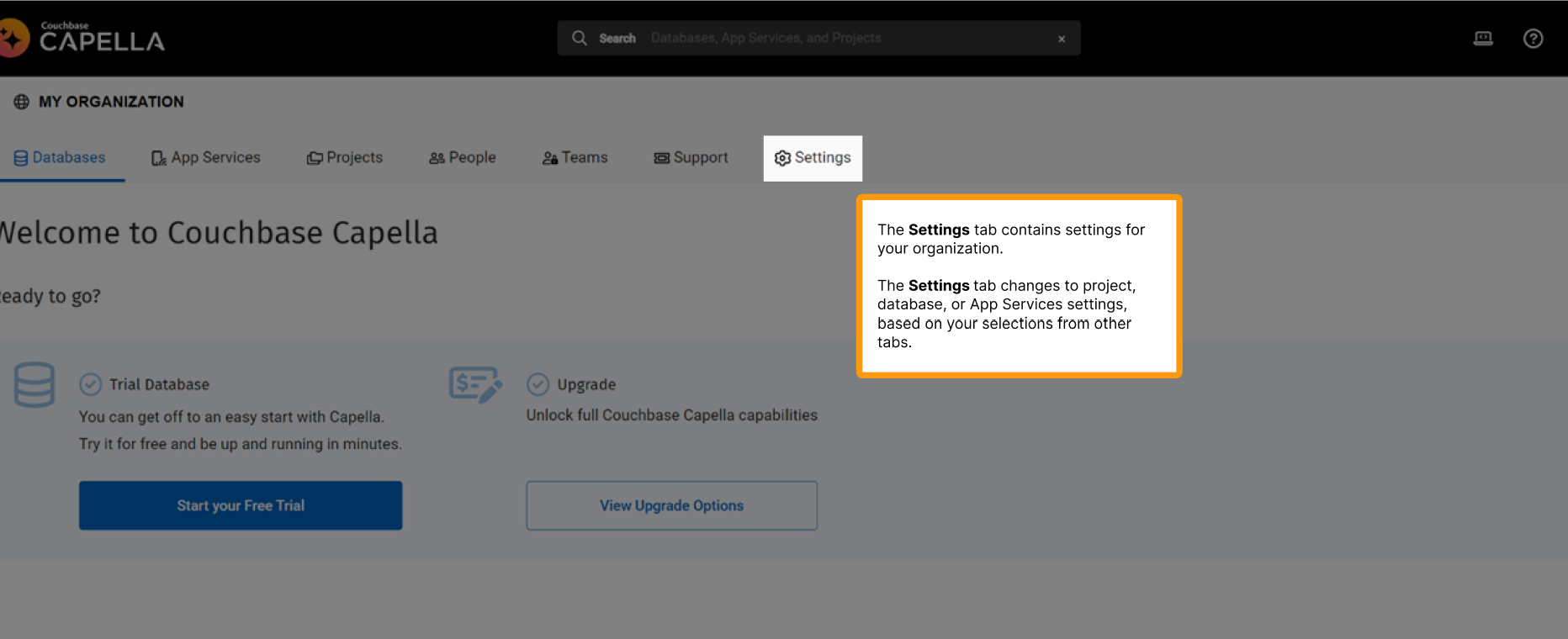
The content tagged as V1 in the Figma was my first attempt at just getting some writing content down on the page. I wasn’t too concerned about the aesthetic matching between the UI and the Guides, because I hadn’t looked too deeply into what the Guide display would actually be like in Pendo.

I tried to just plan out what some of the key parts of the UI the user might want to know about would be, and get some brief explanations or descriptions down for the functionality.
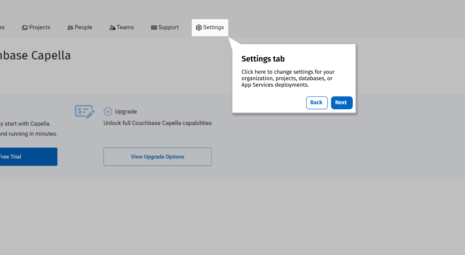
For V2, I was armed with better knowledge of what the look and feel of Guides were actually like in Pendo, and decided to just VERY QUICKLY mock something up that would approximate the look and feel of a Pendo Guide inside Capella. The aim was to emulate the Guide callouts while also trying to match fonts and colours to the Capella UI. My boss wanted two options for the introduction to the user flow, so I added two introduction options at the top of the UI tour. Reading order is otherwise the same!

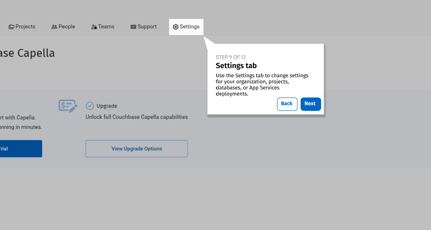
For V3, I took some of my new knowledge from actually chatting with the Pendo team and implementing the Guide in Pendo back to this Figma version, to add some of the resulting polish and create a usable sample of my work.

The Result
While Pendo is currently held up in the implementation phases, we’re waiting to see when we might put this Guide in front of users to start serving its intended purpose of guiding customers through Capella.
We’re hopeful that this, along with the strong governance I’ve set up for Guides through our Pendo Style Guide will result in strong, useful in-app guidance for Capella users, and help increase feature adoption and user retention in the app.